Every now and then I surf the web looking for inspiration and where ever I look I find images that would be very beautiful if it weren’t for that quite obvious mistake.
I do make a lot of them myself and most often I see them during post processing and maybe i manage to get rid of the problem. If not, I’m not going public with that picture.
So let me dig into the details and tell you the most common mistakes done.
Incomplete central objects
This is one of those mistakes I did more frequently, but now a days I’m more aware of it. I often see images with chopped of mountain peaks, half buildings, arms or foots entering the frame from the edges or branches entering the frame mid air. This mistake can be used intentionally as an illusion, but you should really be aware of your edges and give objects enough room.

Non-leveled image
Not leveling the image is one of the mistakes that really destroys an image. It is also one of the intentional mistakes that can extend objects otherwise blended into the image. It is one of the rules that you should really be aware of before you break or bend it.
It is easiest seen in images where the horizon is present. Seeing a beautiful sunset where the ocean is not leveled is horrible. Leveling a non-leveled tree and then rendering other elements non-leveled can be just as bad.

So my suggestion is that you pay attention to your cameras internal leveling tools or use your tripods bubble level. Once you know how to level your images you will also see that you can emphasize objects by bending this rule. A quite steep hill might become even steeper if you tilt the camera just a little.
Out of focus image
A out of focus image is one of those mistakes you cannot fully heal in post process. So paying attention to focus and where the camera is setting focus is critical. One of the main camera parameters is the aperture. The aperture number, often presented as a f-number, will tell you what area in your frame that would be sharp.
Common objects that end up not being sharp is foreground objects like flowers, grass and straws. A colorful flower out of focus will draw a lot of attention in the wrong direction in your image. In portraits eyes should always be in focus. Too wide aperture (small f-number) will render the portraits nose out of focus. Choosing another mode than auto on the camera will reveal the possibility of selecting focus points manually. Selecting the focus point where you would like the image to be at its sharpest is recommended.
Focus and camera technologies are two topics that you will find a lot of information on. There is a handful of approaches on how you will get images acceptably sharp. My advice is to know your camera and know what you would like to be in focus when you frame your image. When you get an out of focus image, analyze what happened and try to correct your mistake the next time you frame your image.
Post process exaggeration
When the digital cameras became common the, almost magical, art of post processing became more available too. Even your smartphone have tools for post processing. Enhancing some elements in your images makes them even better. There might be a color that should be saturated a bit or maybe the image would look better when slightly sharpened.
Some tend to go crazy here. Over saturation and heavily contrasted images will never look good. When you push those post processing sliders a bit over the edge, unwanted effects like halos will appear.
So learn to post process your images and ask for second opinions.

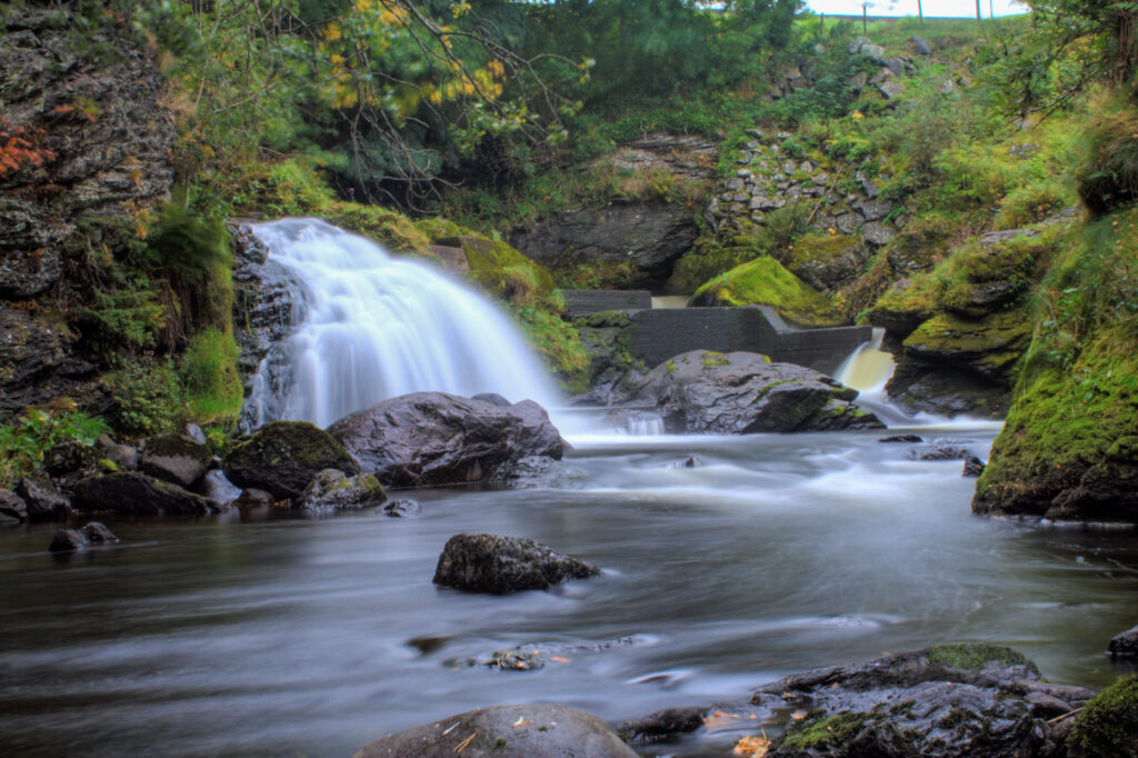
The image above might look OK the first time you see it, but have a look at de details. The little waterfall to the right has a yellow glow to it. The moss to the left of the main waterfall has some strange droplet looking effect on them. This is a typical sign of post process exaggeration.
Signature craziness
And then your master piece is done. Of course you would like to keep it for your self, but still present it to the world. The one thing most people do is to add a signature to the image. And placing a signature can actually give a professional final result.
But adding a massive signature or even watermarking the whole image with your signature will not give that professional result you’re looking for. It will draw too much attention and distract the viewer. Adding objects like a camera or elements that does not exclusively present you for who you are will not work either.

Create yourself a unique looking simple signature and add this to all your images. The size should not be more than 10% of the width and height of the image. If you are afraid that others might use your image, then scale it down before you upload it to the web. Longest edge of 1024 pixels will be acceptable for on screen presentation but almost unusable for printing.
Of course you might have done one or more of the above intentionally, but you should really know the rules before you break them.
Now go out there and get those images 🙂
